Posts

Frank And Ollie: Two of the Nine Old Men
Image
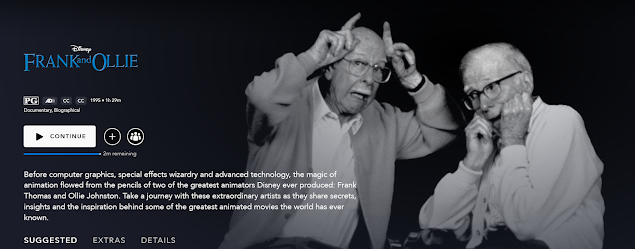
  If you have Disney+, another documentary I would recommend watching is Frank and Ollie. It features Frank Thomas and Ollie Johnston, two of Disney's Nine Old Men. The Nine Old Men were Walt Disney's core animators and all brilliantly talented at that. Aside from animating, they also apprenticed younger animators and passed on their knowledge to them. They also introduced the Twelve Principles of Animation, which were a series of rules and guidelines for animation. I haven't seen this documentary in a while but it's really interesting to watch. It touches on their work at Walt Disney Animation Studios, their friendship, a cool inside look on how animators worked back then. They both played roles in animating films such as Cinderella and The Jungle Book . It's a really sweet documentary and if you're as into Disney as I am, it might be up your alley. Also fun fact: they make a cameo appearance in Pixar's The Incredibles
Different Animation Styles

Image
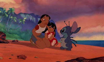
  Once cool thing about animated movies is that sometimes they'll have their own style, in the way they draw the characters, the background, or other aspects of the movie to better fit with the story they're telling. I've seen a few different animation studios do this but I'll focus on Disney for this one. My three main examples are Lilo and Stitch, Hercules, and Atlantis: The Lost Empire .  All three movies were made by the same studio, yet each one looks slightly different. For Lilo and Stitch, they painted the backgrounds with watercolor—something they rarely do— to better fit the aesthetic of Hawai'i. For Hercules, since it takes place in Ancient Greece, everything is stylized to resemble the art and pottery of that time period. Meg's character, for example, was designed to resemble a vase. The silhouettes play a big role in this movie, with every character looking as if they had sprung from a piece of pottery. As for Atlantis, their style is very sharp in

Anastasia

Image
  Anastasia is a 1997 animated movie directed by Don Bluth and Gary Goldman with Fox Animation Studios. The movie is loosely based on Grand Duchess Anastasia of Russia and the rumors of how she escaped the execution of her family in 1918. Several young woman had even posed as Anastasia and claimed to be her. Sadly, as fantastical and bizarre as the story was, young Anastasia did indeed die alongside her family all those years ago.  Still, the story was popular enough to have an animated movie about it, and behold it came to be! In this adaptation, Anastasia survived the massacre of her family but had lost her memory in the process of escaping and went by the name Anya. Meanwhile her grandmother, the Dowager Empress, resides in Paris with a reward for anyone who can reunite her with her long lost granddaughter. Anya runs into Dimitri and Vladimir (secretly two con men) who convince her that she is the lost princess Anastasia and take her to Paris to her grandmother, though they do not

Dreamworks, The Croods, and Animation Styles

Image
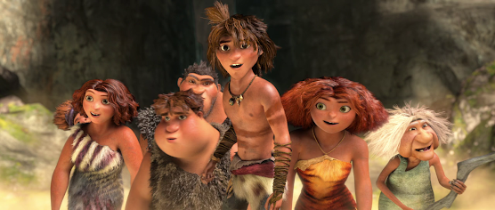
  Since I've been praising animation for all of my past posts, I thought it would be nice to switch it up a little and talk about some ... less amazing things. These are all my personal opinions, so keep that in mind.  Listen, I adored Dreamworks' animation style, specifically with their CG-animated ones. Whether it was Shrek, Kung Fu Panda, or Monsters Vs. Aliens , they all had this more gritty look to it. Not the oversaturated, big-eyed, kiddie vibe you get from other animation studios (not to put any of them down for it, every studio has its own style). I just like that Dreamworks had a more original look to their films. Emphasis on had. My example for this would be The Croods series, although you can definitely see this type of change in the How To Train Your Dragon trilogy and the more recent movies as well.  The first picture is from the first The Croods movie. Now for context, the Croods are a family of cavemen and the aesthetic of the first movie reflects that. You

How To Train Your Dragon

Image
 Dreamworks'  How To Train Your Dragon is and will always be one of the most beloved movies of my childhood (and adulthood, too). It was my favorite movie ever for the longest time and if you've seen this movie, you'll probably understand why.  Hiccup is a young viking who lives in a world where vikings and dragons are constantly fighting and at odds with each other. He wants to join in on the dragon-killing like the rest of his village, but he is not as strong or brawny as the others. What he lacks in muscle though, he surpluses in brains and he catches one of the most deadly dragons, a Night Fury, with a contraption he build. Turns out he doesn't have it in his heart to kill the Night Fury and eventually befriends him, which is very dangerous when you live in an entire town of vikings obsessed with killing dragons.  The animation itself and the story are things I'm sure more than enough people have talked about and I can definitely agree that those are my favorit

Luca's Transformation From Sea Monster to Human

Image
  I know Luca came out just last weekend so this will be a spoiler-free post! What I want to talk about in regards to Pixar's newest animated film (aside from it being one of the cutest and funniest movies they've done!) is how the main characters Luca and Alberto, or just their species in general, transform from sea monsters to humans. There's one scene where we get some really cool shots of Luca slowly transforming. When I first saw it, I thought it was so cool! As the movie went on, I began to wonder how on earth they animated that. I have very basic knowledge on CG computer animation, but it's still so mind-blowing and I could only guess how they were able to do that.  In Luca, the sea monsters all have scales, actual scales that pop out from the model and if you were to run your hand across it, you would feel all the bumps from that texture. Their ears and their "hair", too, are all vastly different materials than their human counterparts. So when Luca t

Stop-Motion Animation

Image
  We'll talk about something a little different here and that is stop-motion animation. You thought drawing each frame of animation is hard work? Try moving puppets around mere millimeters and taking a picture of it for each frame. Actually, both styles of animation are very hard work and take an incredible amount of practice and skill. Stop-motion is a lot more expensive though. Essentially that's what stop-motion animation is: taking a picture of something, moving it just a little bit, taking a picture again, and so on. It can get crazy complicated the more polished and detailed you want your animation to be. Some of the more well-known stop-motion animated movies consists of The Nightmare Before Christmas , Coraline , and the Rudolph the Red-Nosed Reindeer TV special.  Each type of animation has its own kind of flair and magic to it, and stop-motion is no different. It has an aesthetic so unlike those of the hand-drawn or computer-animated variety. It's a different style